Mike’s Shirts Website Redesign

Overview
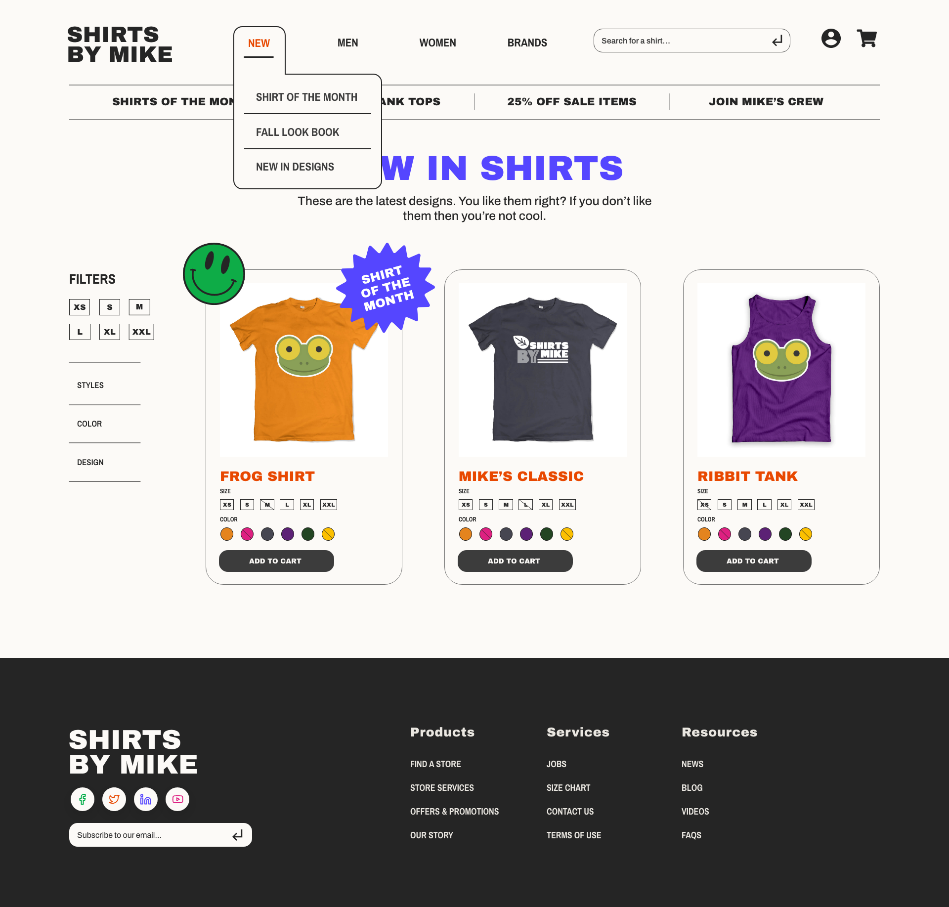
I was tasked with overhauling a website for Mike’s Shirts resulting in new sketches and wireframes for the CEO to approve.
The Initial Problem
At the beginning, the site was dated. It was not reaching its target audience because of that design, and therefore not making sales. The content looked stale, and they wanted to add an ability to have a shirt of the month, highlighting specific designers.
Who’s The Audience
After research, we found that the audience was primarily:
Mostly ages 16-35
Primarily based in the United States
Treehouse students
Lifelong learners
Values community
Playful
Solution
When working to find a solution, we turned to modern design choices and color trends that would allow the site to appeal to the younger audience. In order to highlight certain sales and marketing efforts, I created a series of banners and stickers that would allow messages to be placed on specific shirts. In addition, we wanted to make the site feel very clean as the site before felt clunky and difficult to operate. I kept the user interface clean and sleek in order to let the product stand out.
Learnings
Between the initial wireframes and the high-fidelity wireframes, I completely revamped the style in order to make it feel a little more youthful. I was not quite sure after the initial solution that my designs met the brief, so I was able to pivot and create something that was closer to what the client wanted. I learned that you’re never too late to pivot to create something that is going to be closer to the correct solution.


