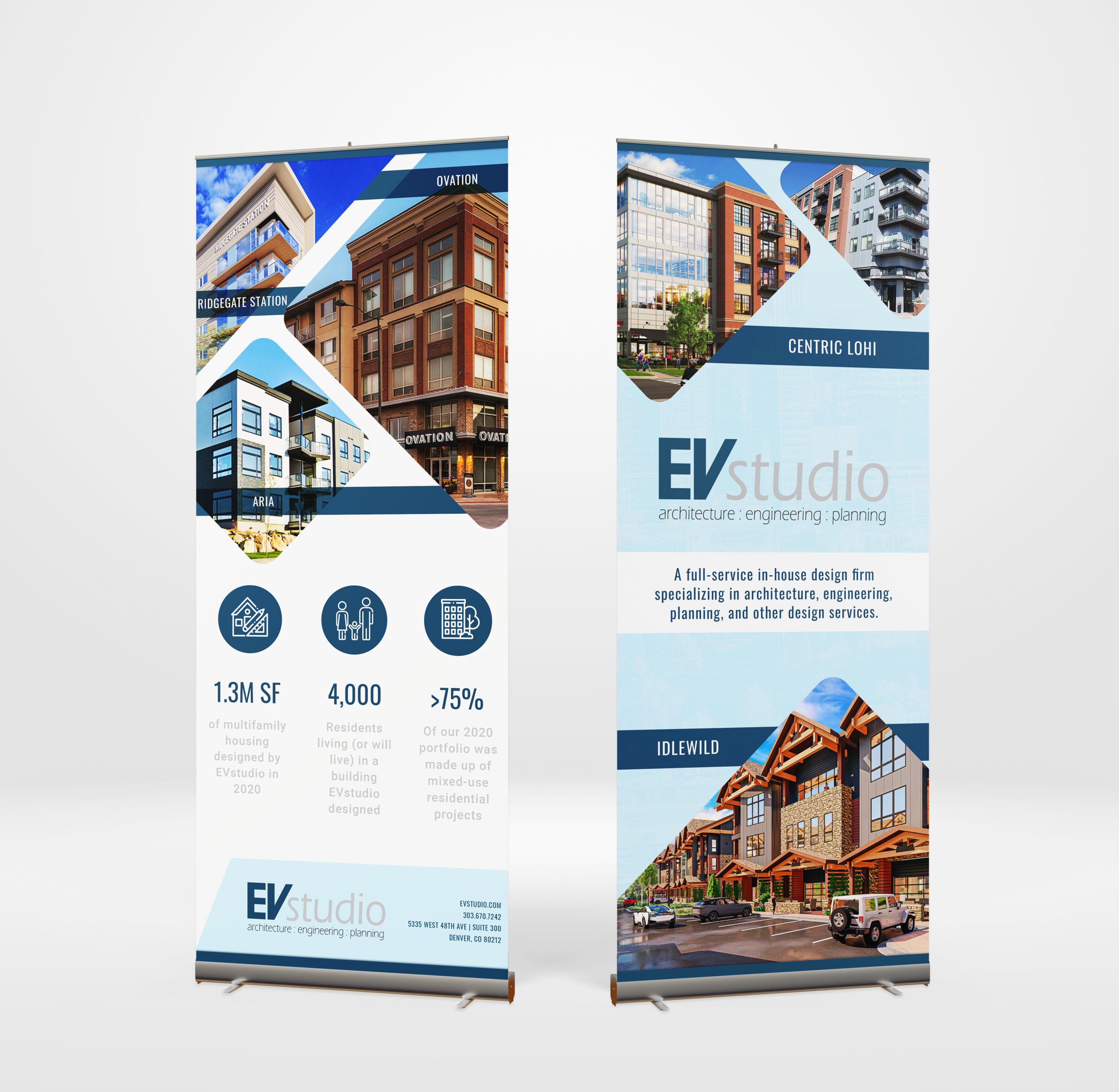
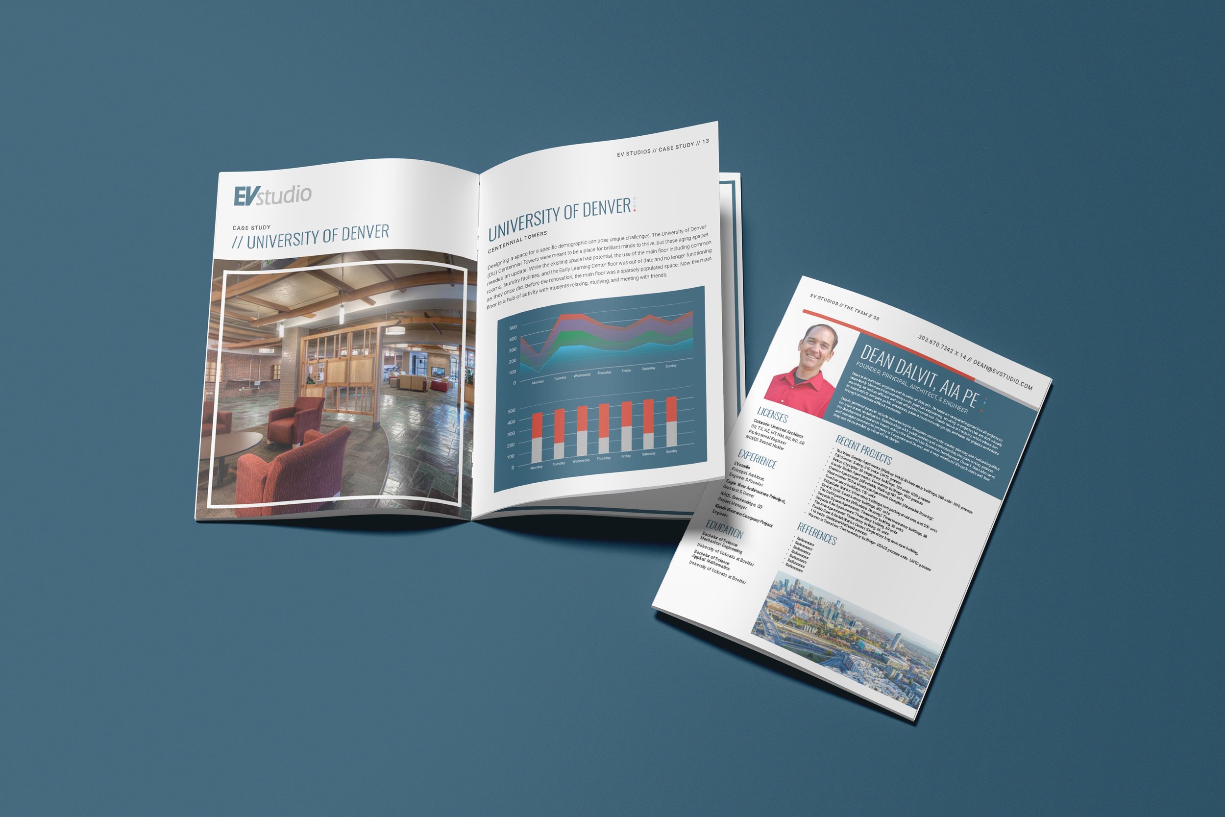
While freelancing with Wunderstuct, I was tasked with launching the rebrand of EV Studios, a jack-of-all-trades when it came to construction and architecture. They were extremely open to design direction but expressed interest in exploring a specific set of primary colors. The rebranding process began with the development of an overview document intended for potential clients, showcasing the studio, its team members, and past projects.
EV STUDIOS REBRAND
BRANDING & PRINT DESIGN
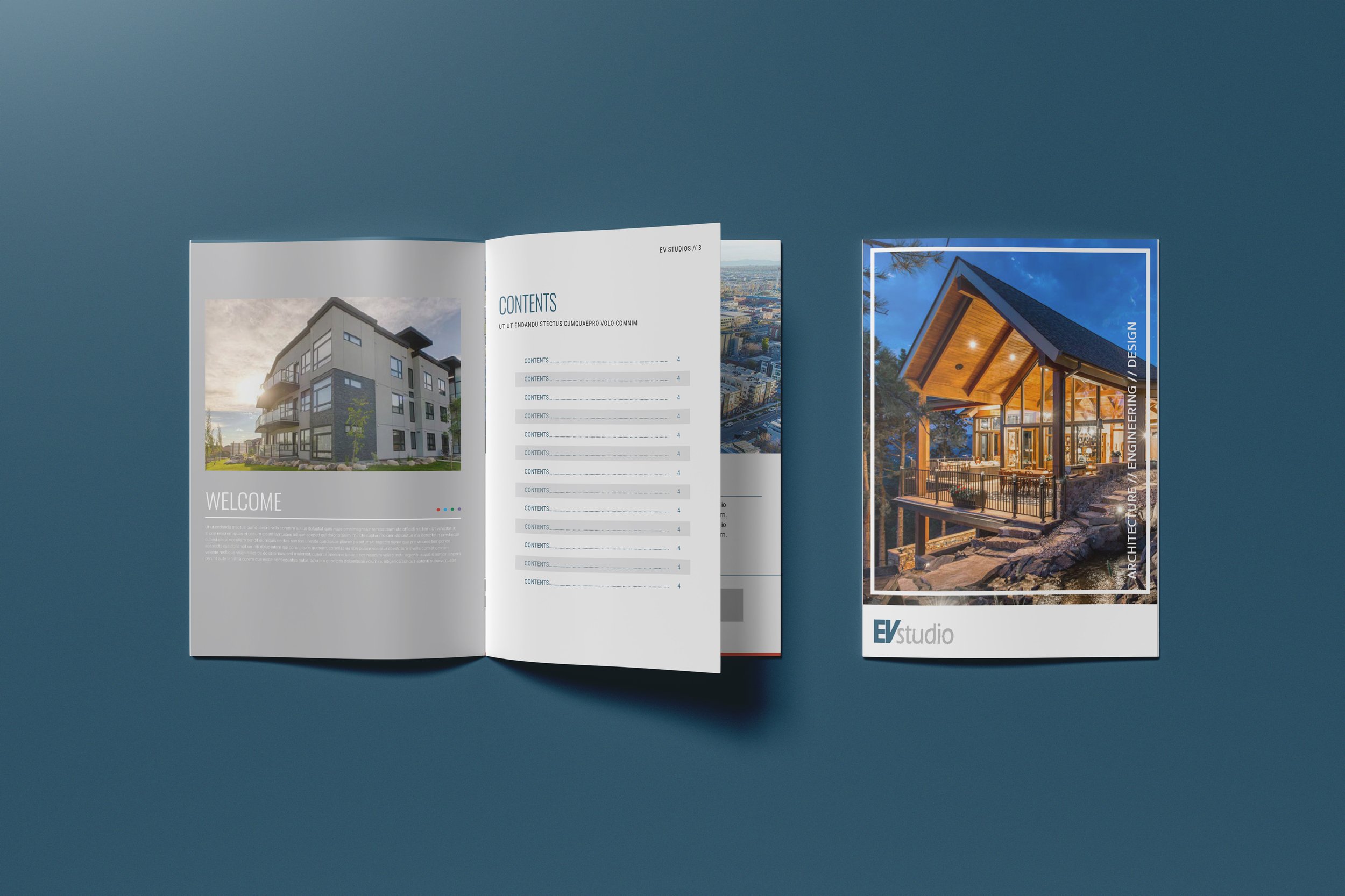
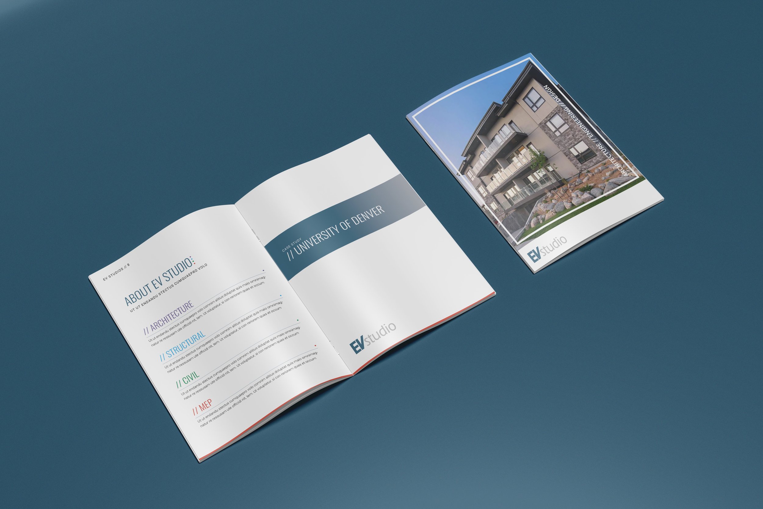
I wanted to establish some guidelines the company could adopt and use across all their other collateral. The challenge is that most of the company members lacked design knowledge, so it needed to be easily accessible. To address this, I provided them with a new set of typefaces that were available on all devices and assigned each studio a distinct color that they could utilize and own when developing brand assets.
DEVELOPING GUIDELINES
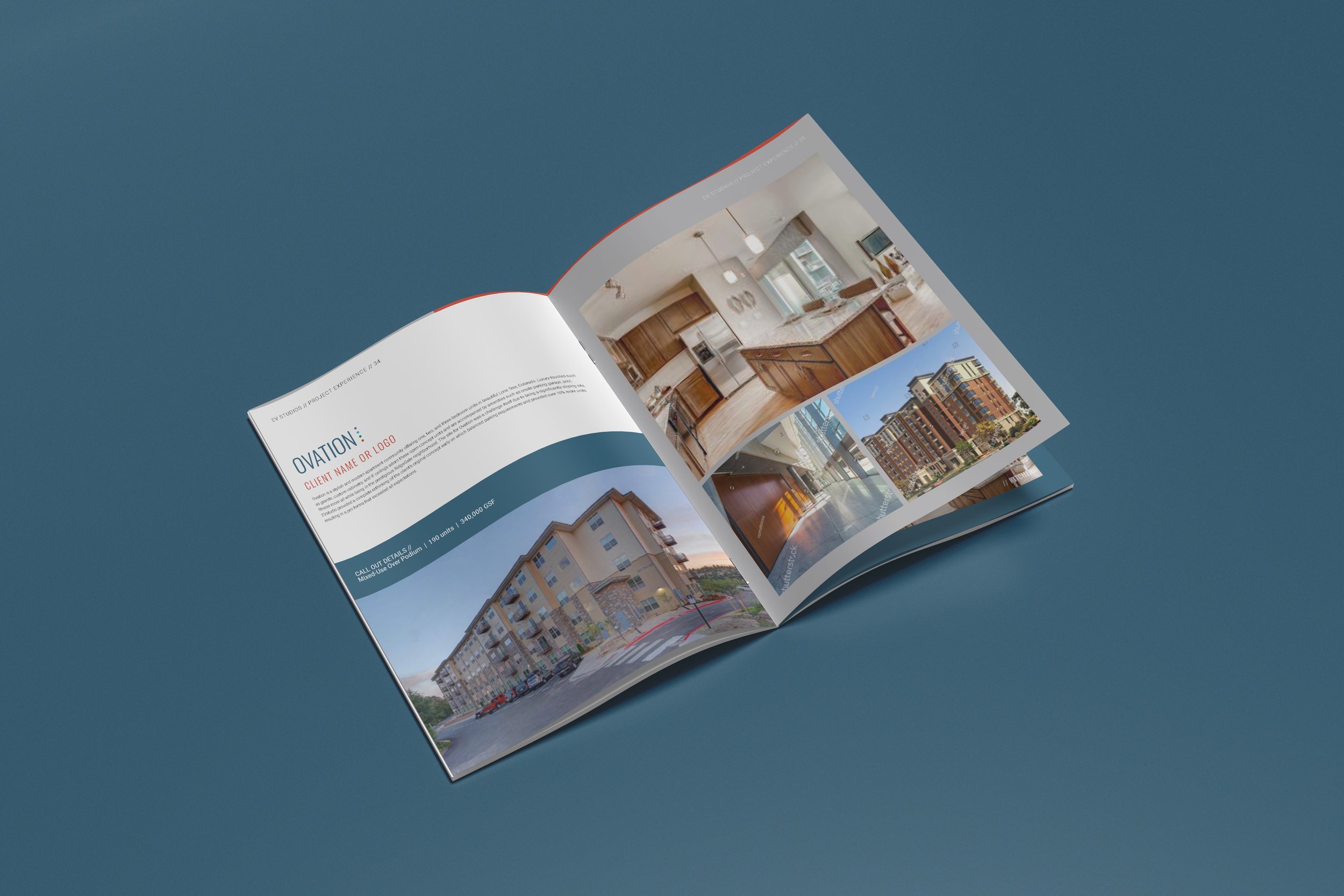
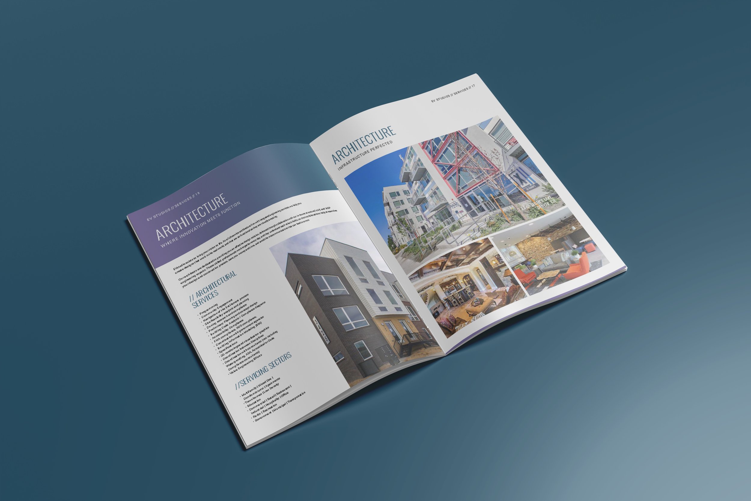
Well, it turns out they loved it, and they wanted to expand further. The next project they entrusted me with was creating a series of pop-up banners for use at trade shows. If you ever attend a trade show with EV Studios, keep an eye out because you might bump into my work!
GOING LIVE
