FLIPBOARD NOTES
BRANDING & UX DESIGN

FLIPBOARD NOTES LAUNCH
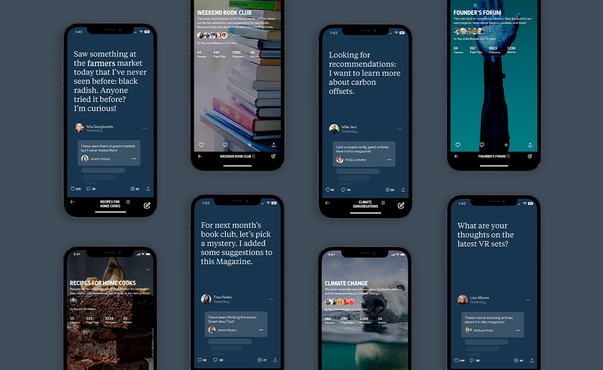
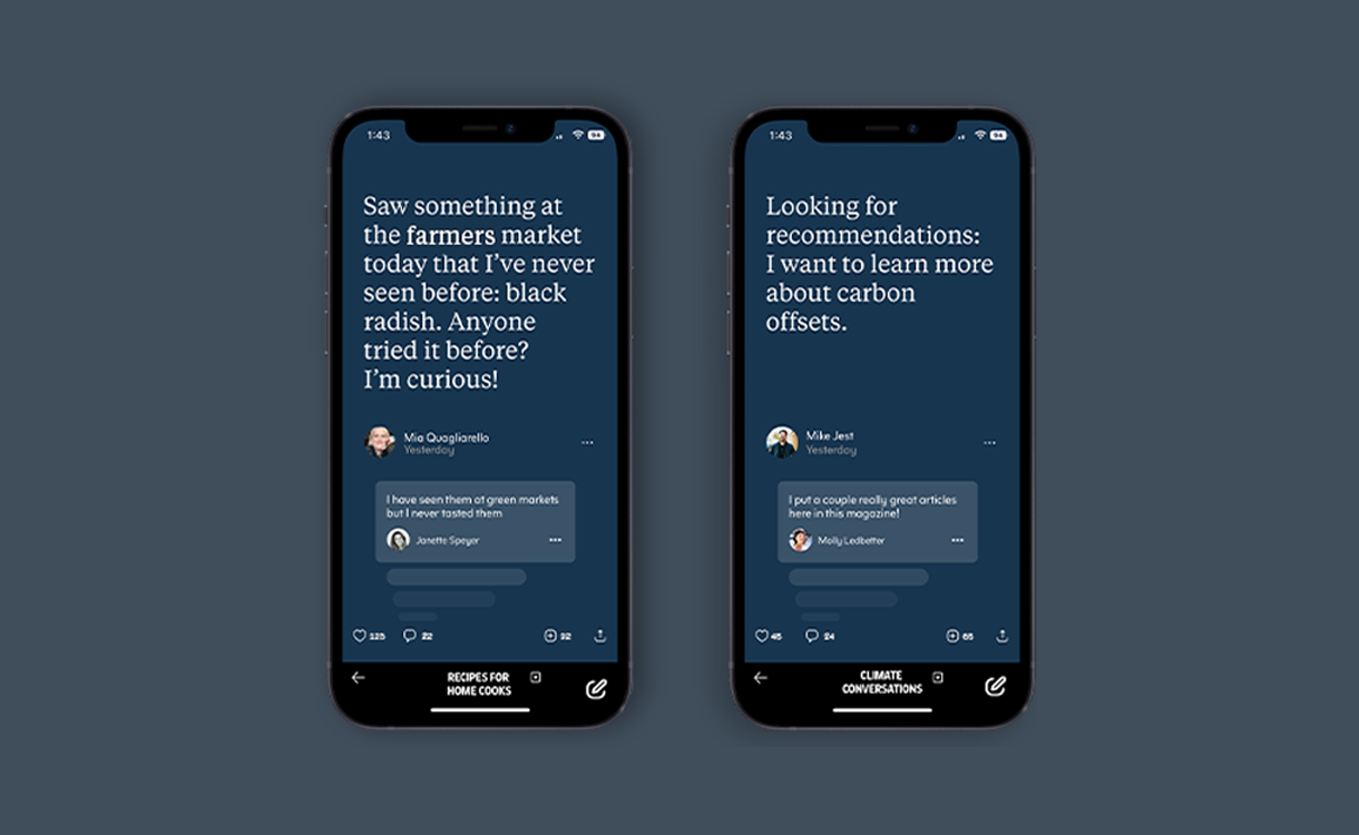
I was lucky enough to spearhead the launch of the new product, Flipboard Notes, which gave users a way to spur conversations on the app. I came in at the end of the product cycle, working with the design team to finalize the look and feel of the product in the app. After which, I created marketing materials to deliver to users about the new product.

CREATING AN EMAIL EXPERIENCE
Once the product was launched, the next step was to extend the product into an email experience. Since half of Flipboard users are only email newsletter subscribers, it was essential to develop something to get them back and interacting on the app. I used my newly minted UX skills to design and test a Note’s experience in Figma, working with the email team. Because of this experience, we saw an uptick in downloads by 10%!

FOSTERING COMMUNITIES
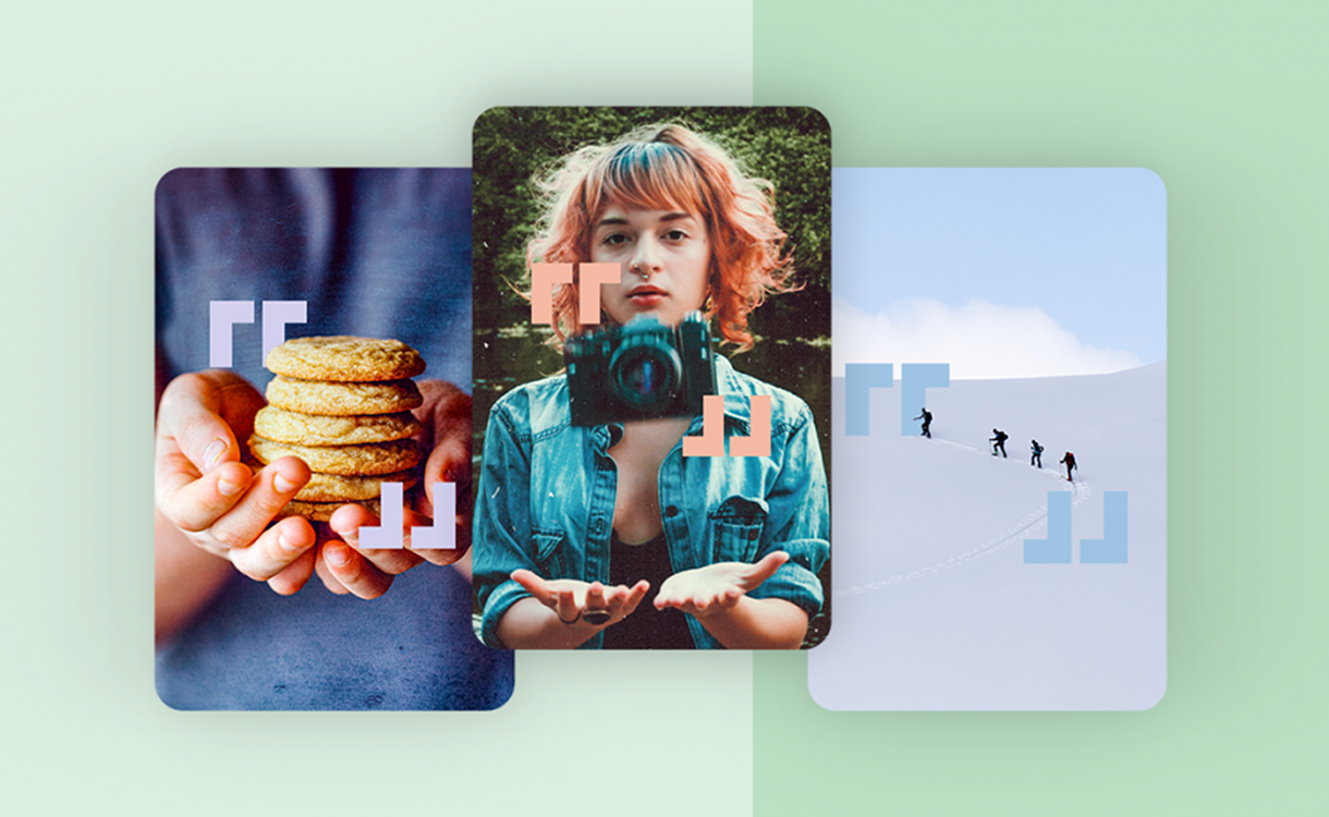
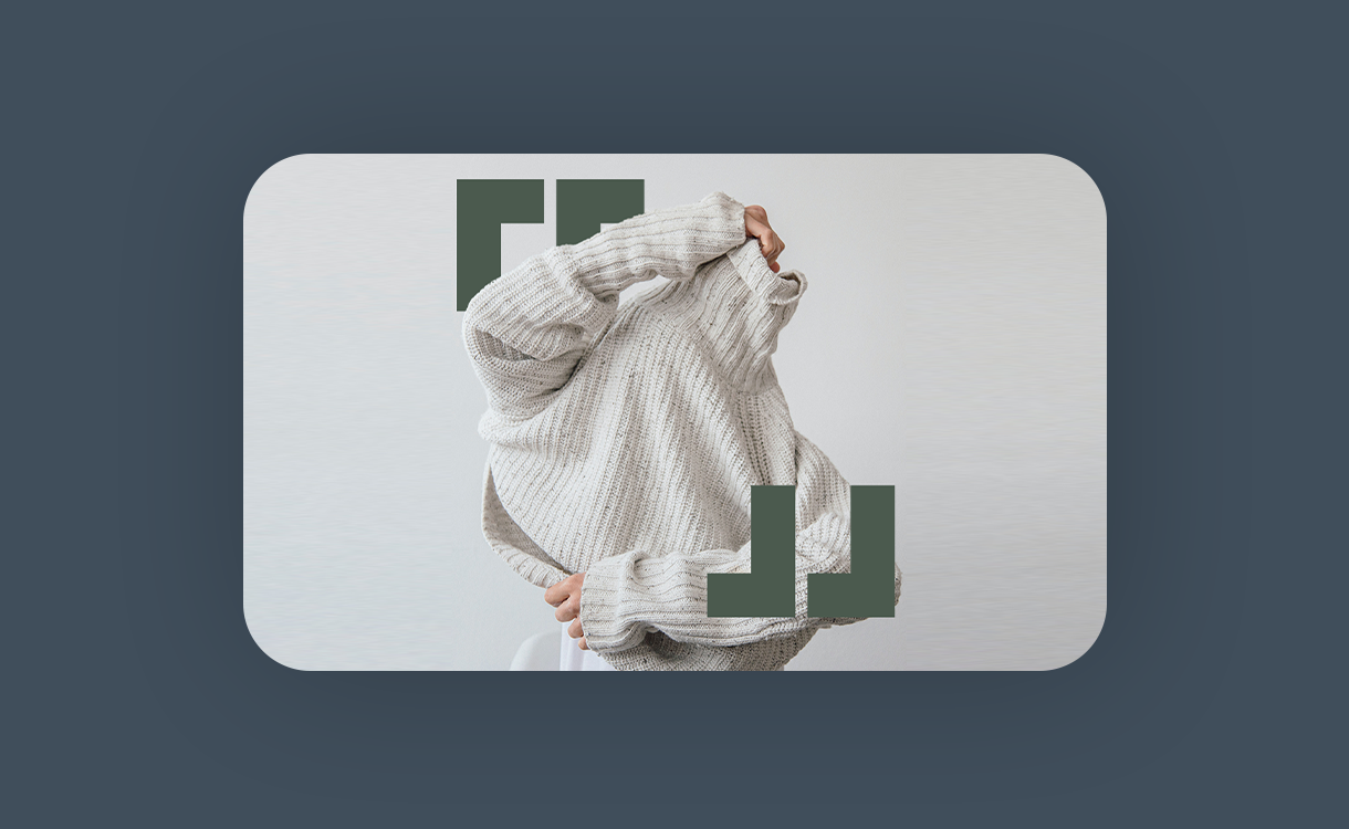
Once we were driving people back to the app, it was important to have a place for them to have conversations. That’s when the marketing team had the idea to create The Exchanges. The Recipe Exchange, Photography Exchange, and Travel Exchange were formed, and it was then my job to develop the branding for them. I used the standard Flipboard brackets with the new email newsletter color story to connect the experiences cross-platform. We wanted to show this was a place for people to have conversations, so we played with depth to tell that story. They were so successful at the launch that we ended up developing a style exchange as well!


DEVELOPING THE PRODUCT
Like with any product, once it was launched, it was time to continue development. When announcing updates, I wanted the branding to be consistent and expand upon the collateral we had created in the launch.

