SURF: A FLIPBOARD PRODUCT
BRANDING & UX DESIGN
In becoming the leader of Fediverse adoption, Flipboard wanted to develop its first sister product to easily surf through and organize all the content online. Thus, Surf was born!
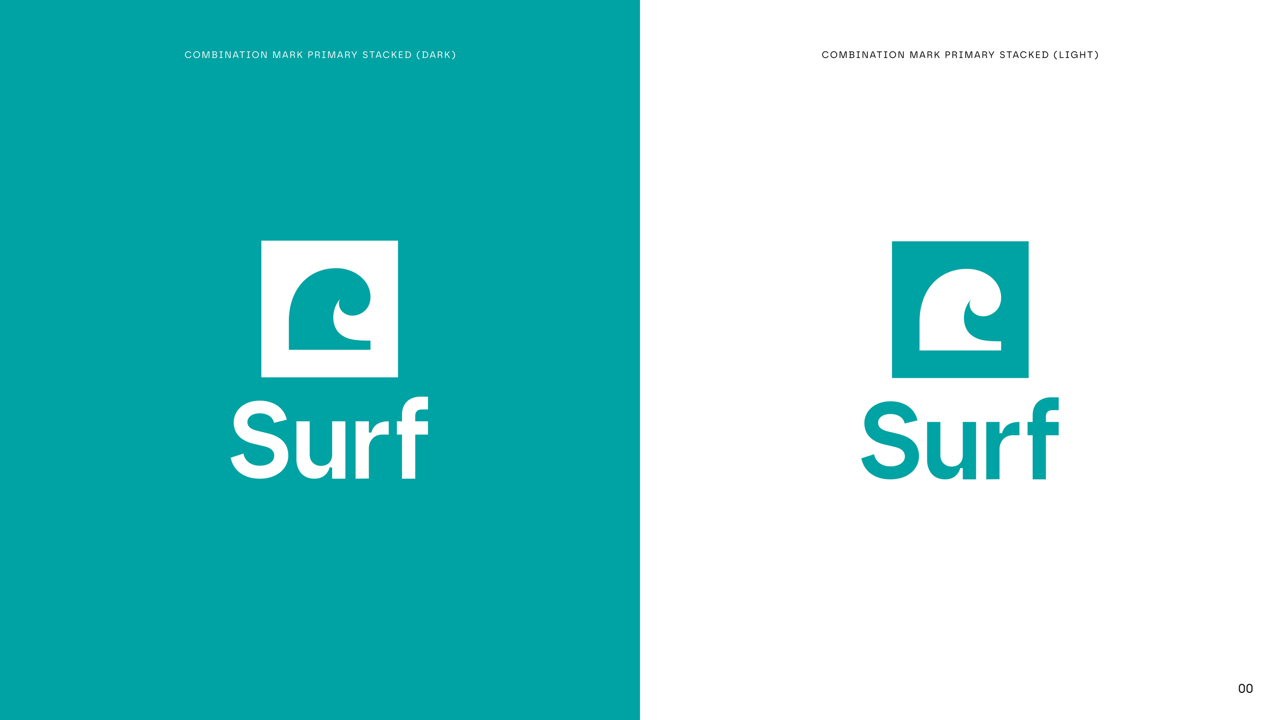
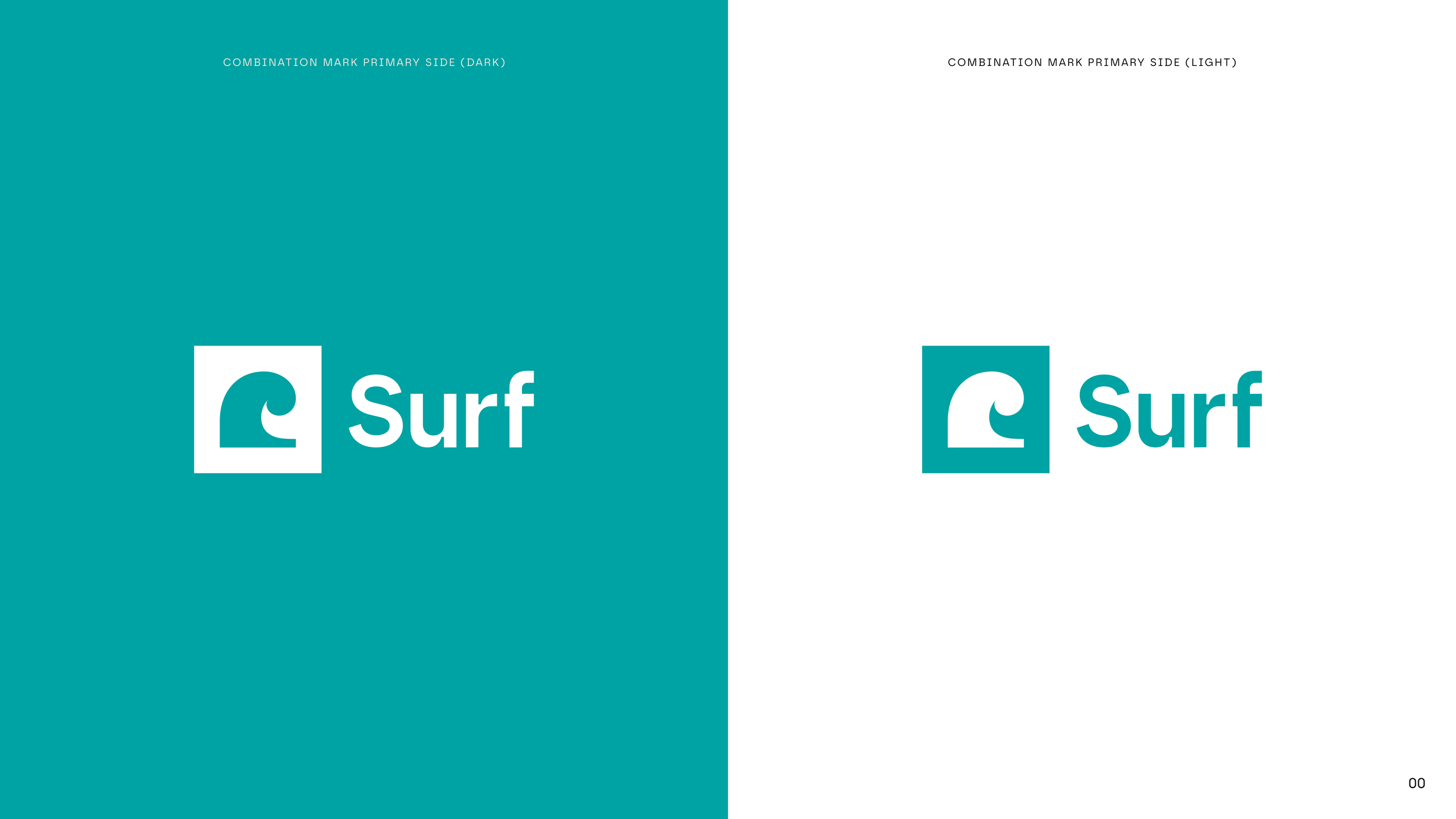
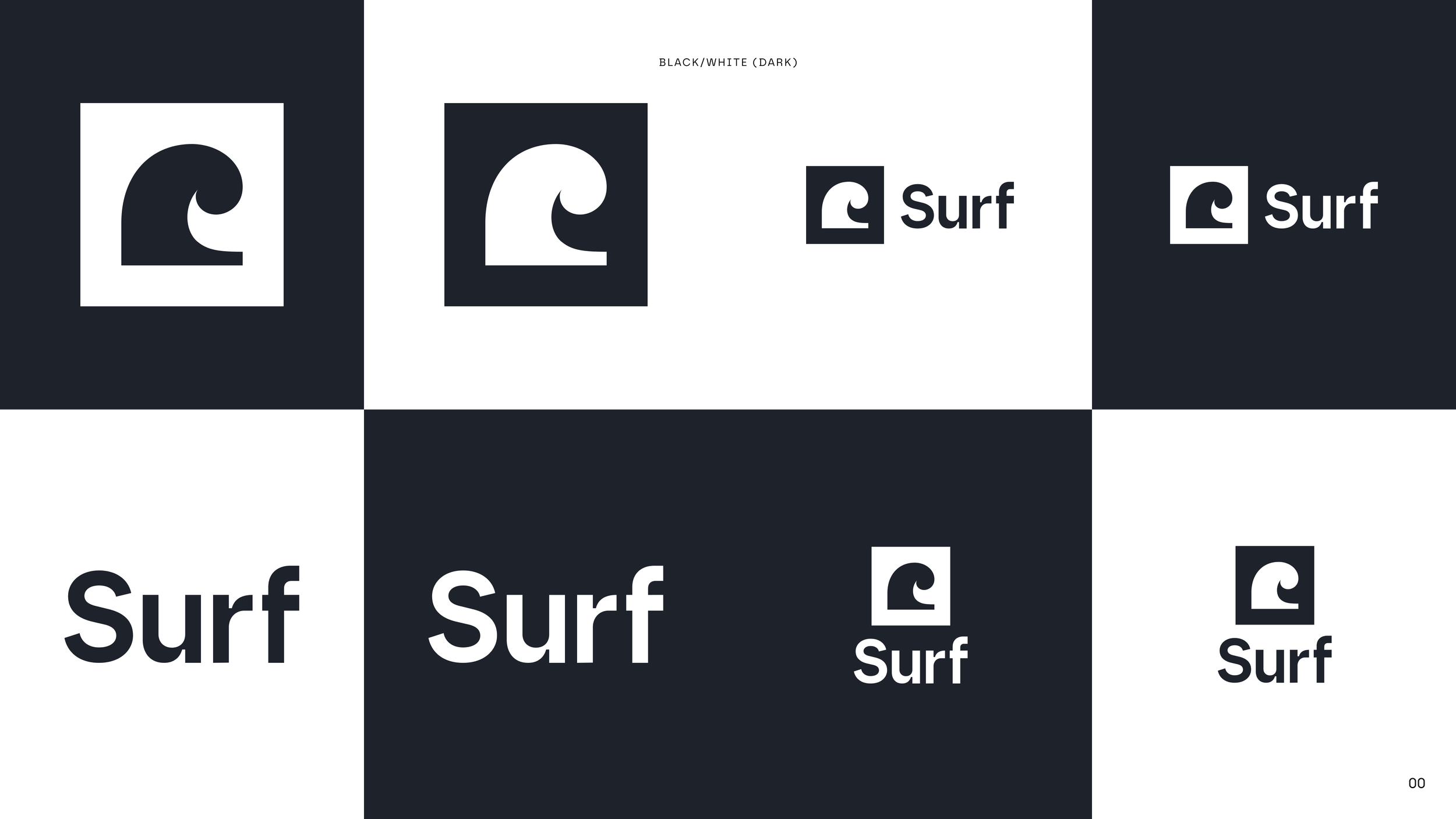
One of the first steps in developing this product and securing funding was branding. I was fortunate enough to be on the team that crafted this branding. We aimed for something that would harmonize with Flipboard, creating a logo that would echo Flipboard’s Bauhaus principles while also asserting its own identity. Additionally, we tapped into the concept of surfing and online conversations, incorporating the Fibonacci Curve to fashion a wave and quote mark hybrid.
When selecting colors, we opted for hues situated at the opposite end of the color wheel, choosing teal to complement the red. Subsequently, we drew inspiration from oceanic tones to assemble our color palette.



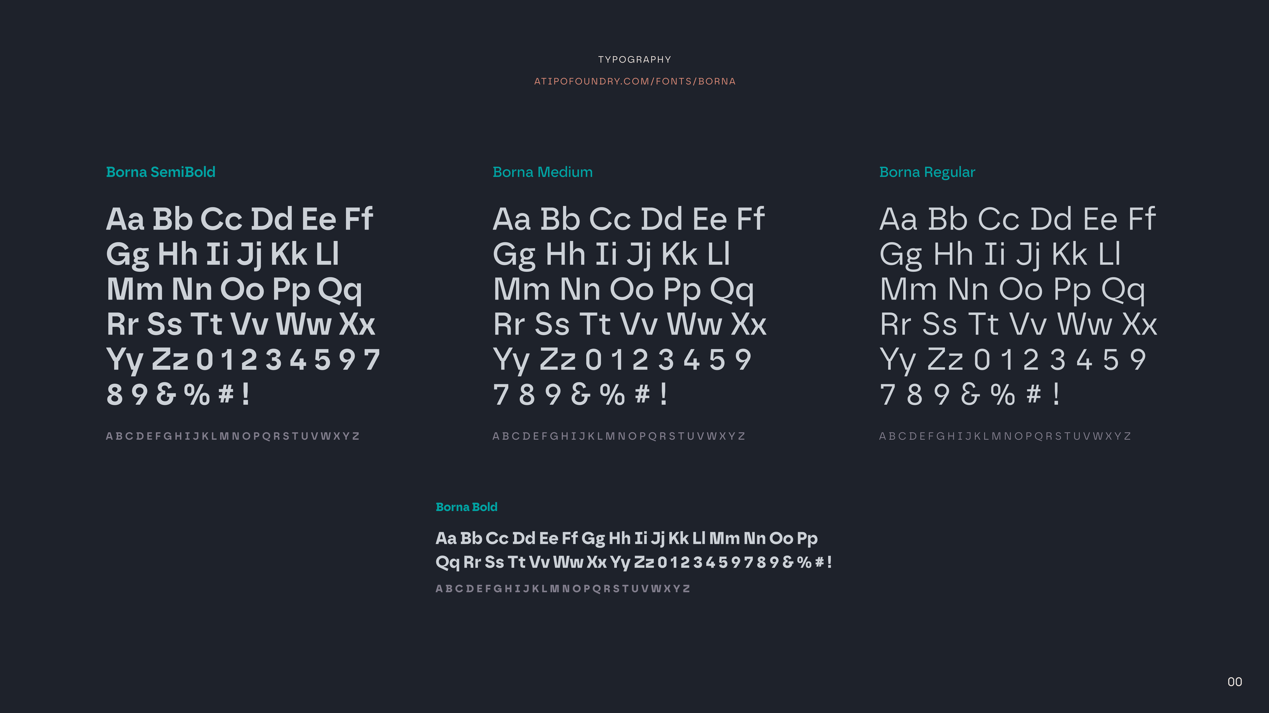
CHOOSING A TYPEFACE
Then came the age-old question: which font should we use? Should we retain the custom Flipboard font or embrace something new? Ultimately, we settled on a typeface called Borna. This decision would grant the brand its distinct voice, suitable for widespread use across the internet!
DEVELOPING THE BRAND
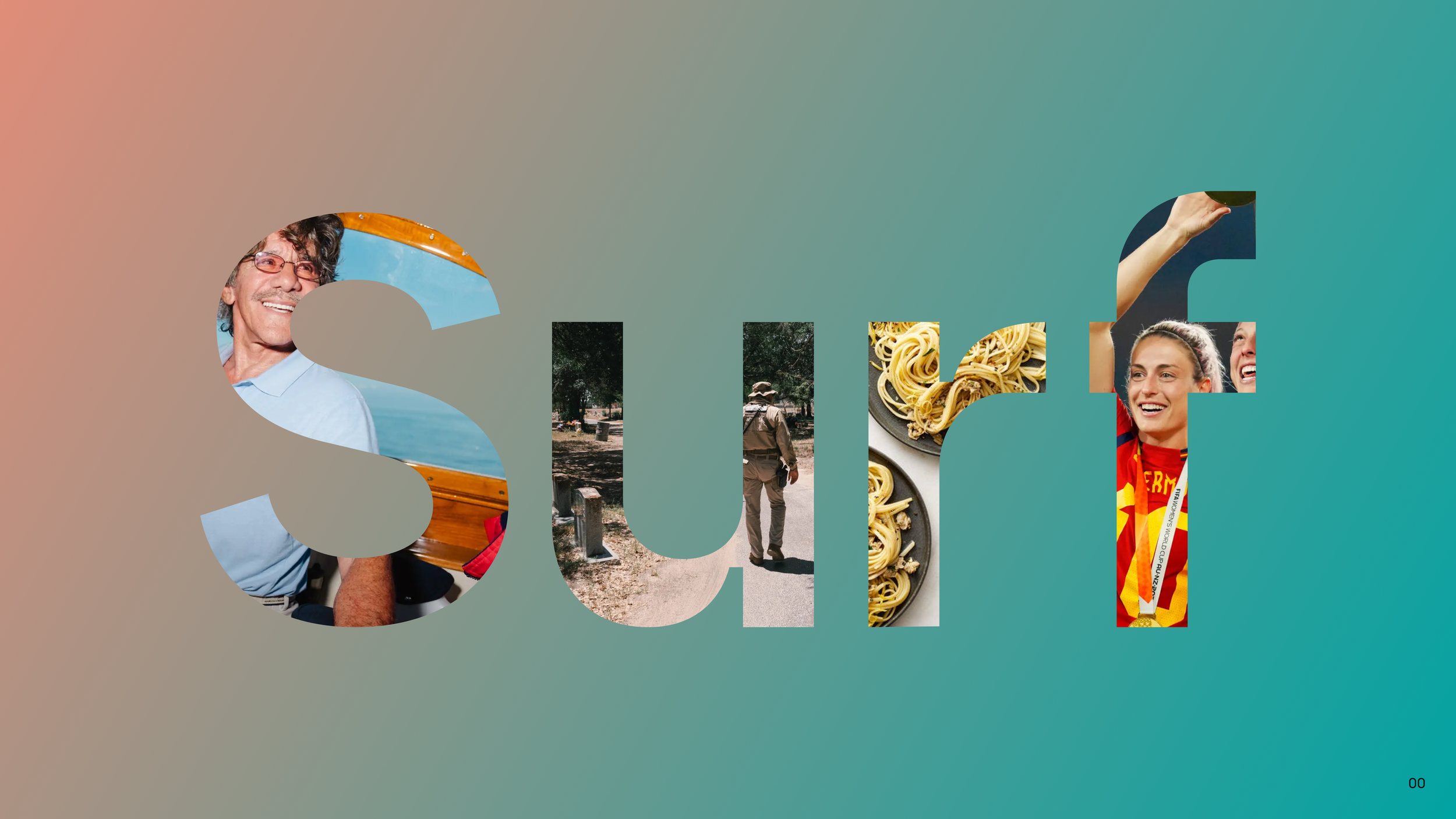
Once the guidelines were established, it was time to illustrate how the branding might evolve. Flipboard heavily relies on photography and peeking through the Flipboard “F”. This was a feature we were keen to incorporate into the new brand, thus developing a proof of concept for investors was crucial.

INTEGRATING THE EXPERIENCE
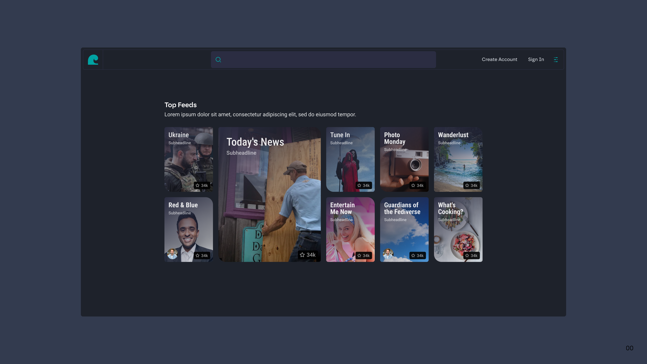
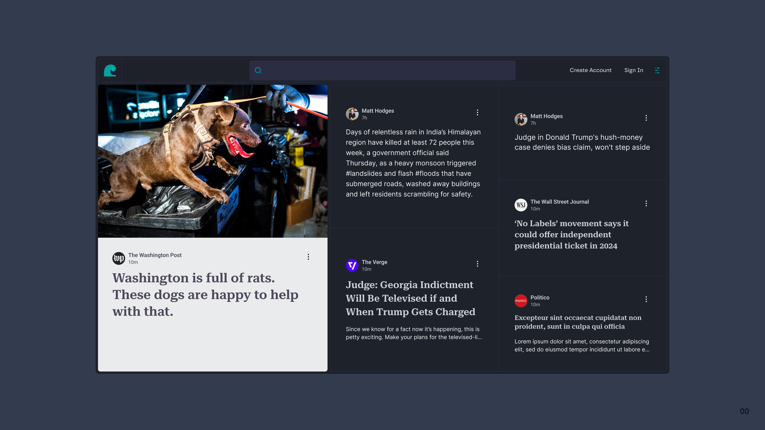
With the brand created, the pressing question was: would it translate effectively into the user experience? That was the puzzle we needed to solve. Subsequently, the team crafted screens depicting how the experience of browsing the Fediverse on Surf might unfold. And if you ask me? It looks pretty engaging.




TEASING THE LAUNCH
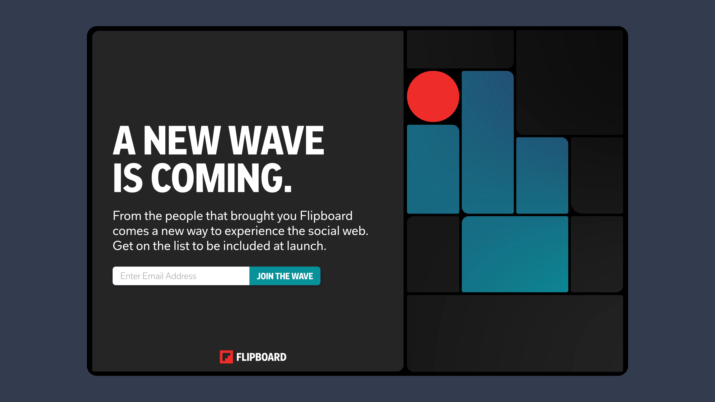
Before the official announcement, we sought to entice the audience with a landing page offering more insights. This page was intended for use with the Dot Social Podcast, thus we aimed for synergy in branding between both platforms. I took charge of designing the UX for this page, drawing upon the Bauhaus principles of both brands. I incorporated a gradient swirl video to hint at something new bubbling under the surface. And you know what? It stirred up excitement!

