Right when I started my contract at Flipboard, I was tasked with integrating a completely new set of colors into the brand. Honestly, I was thrilled to take on the task.
FLIPBOARD REBRAND
BRANDING & DESIGN

EMAIL NEWSLETTER OVERHAUL
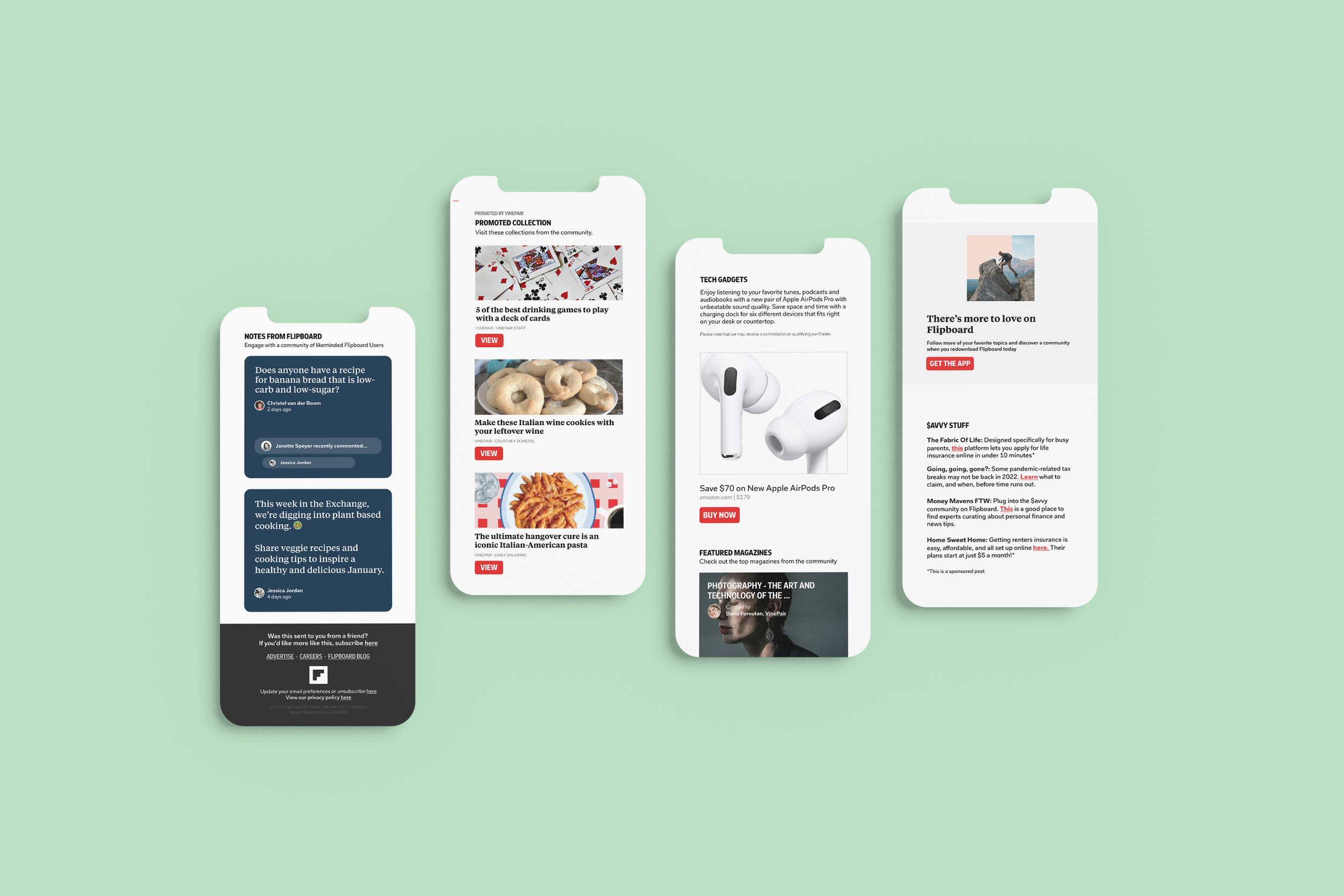
The first task in this rebrand was the Flipboard Email Newsletter redesign. Since the newsletter users make up over half of Flipboard’s users, we wanted to ensure the user experience was flawless. Given that Flipboard is all about news, I drew design principles from newspapers to mimic that experience. To integrate the colors, I assigned each newsletter a color that could seamlessly transition between the app and newsletter experience.

MOVING THE GUIDELINES INTO THE BRAND
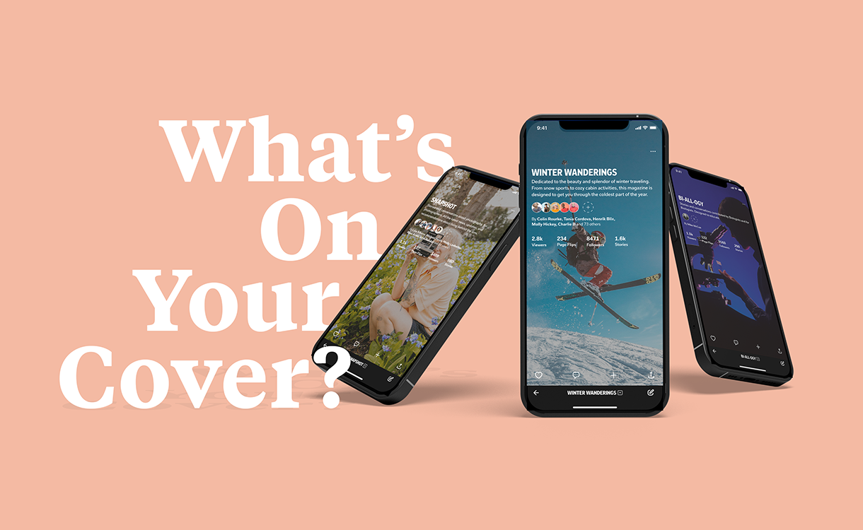
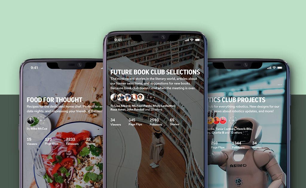
After launching the overhaul, it was time to further integrate the designs. I created numerous designs during my time at Flipboard that further integrated these colors and design principles. I was truly responsible for transitioning Flipboard from news to lifestyle.
